

There’s no denying that there’s a certain fascination with the world’s most powerful families. When that power has been built through the development of a billion dollar company, you can only imagine the family dynamics, the power struggles, politics and corruption. Particularly if that company is a media empire, which inevitably has immense influence over what the world hears and thinks.
The hit HBO American television drama series Succession, which follows the Roy family, the dysfunctional owners of global media conglomerate Waystar Royco, has given us a peek, albeit a fictional one, behind the scenes of one of these families. With the final season in our midst, we will finally (hopefully) find out who will take over the Waystar empire when the family patriarch Logan Roy, a ruthless businessman, retires. His four adult children, Kendall, Roman, Shiv and Connor, have spent three tumultuous seasons vying for his approval.
No matter which family member takes over, one can anticipate they will begin their reign by making a statement and what better way to do so than a complete rebrand. Given that branding is our area of expertise, we challenged our global community of designers to reimagine the Waystar brands—Waystar Royco, Waystar Studios, ATN News and Brightstar Adventure Park—with a fresh look inspired by the biggest logo design trends.
Only the most innovative and creative will suit the Roy family and therein lies the perfect opportunity to push boundaries and explore the most innovative and unexpected design styles. Do you think Logan Roy would approve?
Waystar Royco
—
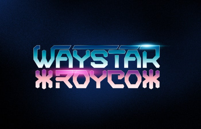
For an iconic brand like Waystar Royco, at least in the fictional world of Succession, there’s the need to convey a modern, cutting-edge image. That is why it makes sense that designer Glerm Rubini was inspired by the submerged in sci-fi logo trend, incorporating futuristic elements that signify that the company is capable of making what may seem impossible (and ahead of our time) a reality. As Glerm Rubini notes, “This trend plays with people’s imagination. The use of sci-fi references in branding brings the ‘what-if’ factor to a business.”
While this trend can gravitate towards darker hues, characteristic of dystopian sci-fi worlds, the choice to use striking bright colors in this design adds to the logo’s futuristic feel and cultivates a sense of optimism.
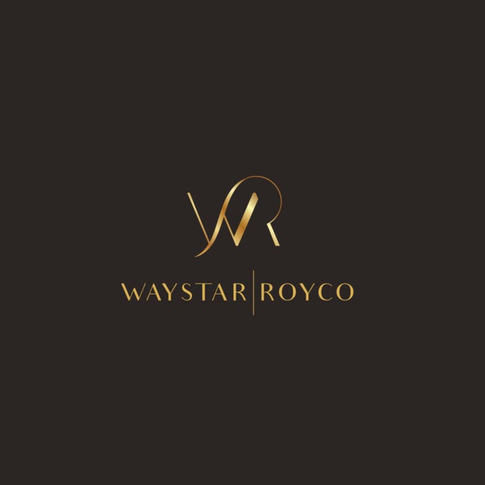
There’s no doubt that at least one member of the Roy family would be keen to infuse the grandeur of the 1920s Art Deco movement into the Waystar Royco branding. Above, we see designer tetrimistipurelina do just that, but with a contemporary twist.
The Roaring ’20s style is experiencing a revival in the modern art deco trend. The aesthetic still feels quite luxurious and romantic but encourages greater experimentation with letter anatomy—playing with weight, thickness and stems—achieving intricate lines and aerodynamic curves.
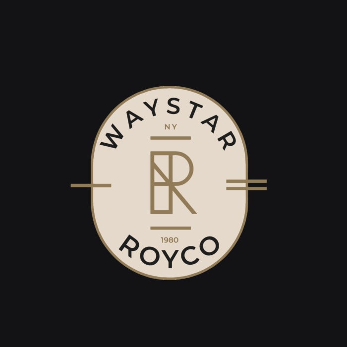
In the spirit of Waystar Royco’s New York home base, designer《•ckmr•》explores 2023’s twists on traditional designs trend, where creatives convert traditional, cultural imagery into striking modern designs. In the logo you see above,《•ckmr•》explains the “R” in the middle is almost architectural, suggesting the hierarchy of the Roy family, not only in the company but in society. The logo is modern with a touch of heritage.
Waystar Studios
—

For Waystar Studios, an entity known for its world-class entertainment, the branding certainly shouldn’t feel too business-like. Its logo has to embrace the creativity of the productions the studios bring to life—and that’s exactly what designer Angela Cuellar has done, inspired by the loosely interpreted lettermarks trend.
This logo trend rebels against the generalization that logos should be simple and straightforward. Rather it embraces geometric shapes and white space, where abstract intrigue comes first and legibility comes second. With this approach, the viewer must spend a little extra time interpreting what they are looking at and therein attracts a sudden interest in the brand.
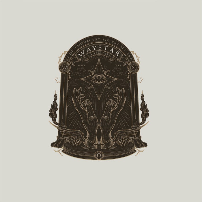
Stars for the stars! One of 2023’s biggest graphic design and logo trends is mysticism and mythology. Think astrological symbolism, zodiac signs, crystals and tarot cards. Thanks in large part to the ongoing uncertainty we have experienced at a global scale the last few years, consumers are seeking escape and a deeper connection with a higher power—and whoever takes over Waystar Studios would undoubtedly leverage this collective desire to benefit the brand.
Above we see how this trend can be approached in two ways. Designer《•ckmr•》, a big fan of the occult, mysticism and metaphysical world himself, was inspired to use this style for this fictional media empire given the power of media to shape individual beliefs and perceptions. You can see intricate details within the hands like the hidden eyes and nose, suggesting the brand is an ever-present influence. The fire on the sides represents action, turbulence and power. The mythical wings and beastly paws symbolize that Waystar Studios is a living, breathing being, ultimately portraying Waystar as the higher power the Roy family believes it to be.

On the other hand, designer danoveight approaches this trend with a more romantic, even playful energy, showcasing more the fascination surrounding mysticism and mythology and Waystar Studios’ role as a storyteller. “The sun on top and moon at the bottom symbolize that there is time and two sides to everything, while the small stars represent that inspiration and stories that can come from everywhere, from simple daily life, the deepest of imagination and as far as the stars,” danoveight explains of the design.
For both approaches, there’s no denying that mysticism could give any brand the power to tell its story through its logo.
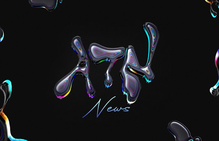
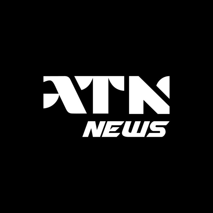
ATN News
—
In 2023, creatives have continued the Y2K revival that began the previous year with the throwback liquid mercury fonts logo trend. This aesthetic oozes excitement and freedom. Each letter is unevenly distributed with rounded edges as if it had been slowly dripped onto a piece of paper. Despite originally finding popularity in the early 2000s, the style feels modern and unrestricted.
It’s not what you’d expect of the “number one network in all of cable” in the fictional world of Succession—and that is exactly the point. Designer Glerm Rubini completes the look with metallic chrome to infuse the brand with even more energy. Of this trend, Glerm says, “I believe that nowadays it can be a great visual style for trendy startups or brands that want to be seen as cool in an unknown future.”
Perhaps a more reasonable approach for a popular news network, AnaMaria.Design leveraged the distorted geometry logo trend to reimagine the ATN News logo. While geometric shapes have always had a place in logo design, they have often been structured and predictable. This trend flips that tradition on its head, flaunting jagged compositions, unexpected spaces and razor edges. It’s an appropriate approach for a conservative brand that wants to display some level of deviance without becoming unrecognizable. As Ana-Maria describes, “This trend is a wonderful way to create clever, easily recognizable and memorable logos. It arouses the curiosity of the viewers, makes them want to take a closer look and perhaps find a meaning.”
Rather than communicating a sense of rebellion, the molecule-inspired abstract patterning logo trend is about connection. This aesthetic incorporates DNA helices, the foundation of life, to create a sense of belonging in an abstract and fluid way. As designer harrysvellas explains, “I used this trend because it really fits ATN—it looks catchy, modern and fresh.”
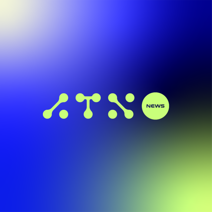
Given its scientific foundation, this style can signify technological progress and advancement, which could be a great value proposition for a brand like ATN News to communicate.
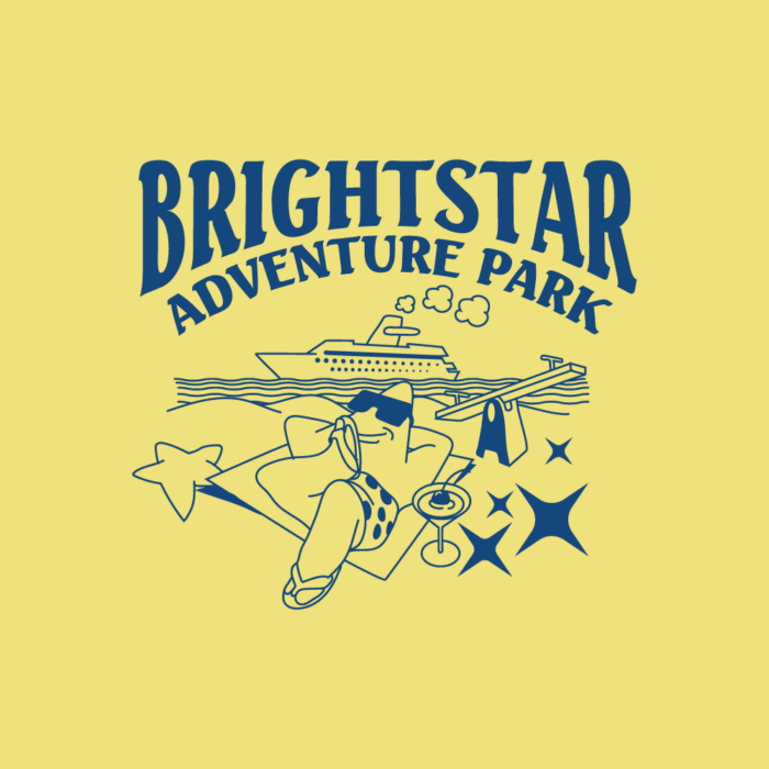
Brightstar Adventure Park
—
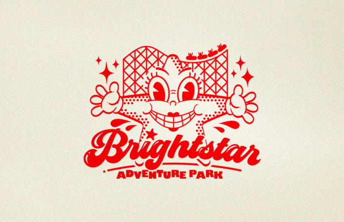
We end with two designs for Brightstar Adventure Park, each displaying different, albeit similar looking, trends. Brightstar Adventure Park represents an experience—fun theme parks that are full of life. Above, Glerm Rubini evokes that energy with the comic-inspired retro red liner logo trend. Characterized by 2D illustrations of exaggerated characters and a key ingredient, the color red, Glerm notes, “This style creates an awesome mix of happiness and weirdness that makes it easy for young people to relate with, and that’s why it can be a perfect style for a theme park.”
The playful line doodles trend, used by designer rizzleys in the logo you see above, is likewise intended to convey fun and positivity. This approach is less comic strip and more akin to childhood doodling while daydreaming in school. The playful line drawings make you smile and lift your spirits.
Both trends achieve a sense of escapism that Brightstar Adventure Park undoubtedly would strive to deliver to its customers.
Elevating iconic brands with 2023’s leading design trends
—
Whether fictional or not, the world’s most iconic brands need iconic branding. As we bid farewell to the Roy family, they can finally have a glimpse of the caliber of logo design they would have needed to thrive into the remainder of 2023 and beyond. Design has the power to tell a story. From modern art deco to submerged in sci-fi to mysticism and throwback liquid mercury fonts, 2023’s leading design trends have certainly brought the Waystar Royco narrative to life.
Want to polish and perfect a forward-thinking logo?
Work with our talented designers to make it happen
VISTA, VISTAPRINT, 99designs, and VISTACREATE are trademarks or registered trademarks of the Cimpress group of companies. All other marks, including those of Succession, Waystar Royco and respective Waystar Royco subsidiaries are the trademarks of their respective owners. This article is being presented as a study on current design trends as reflected by hypothetical Waystar Royco team logos and Cimpress has no affiliation, sponsorship or other relationship with HBO’s Succession or sponsors.
The post Succession brands reimagined with 2023 design trends appeared first on 99designs.